Insurance choices dwindling in counties across America
Yesterday I noted news released this week from the Centers for Medicare & Medicaid Services (CMS) that shows only half the insurers that offered coverage on Obamacare exchanges in 2016 plan to participate in 2018. That’s a dramatic drop in choice for consumers in just two short years.
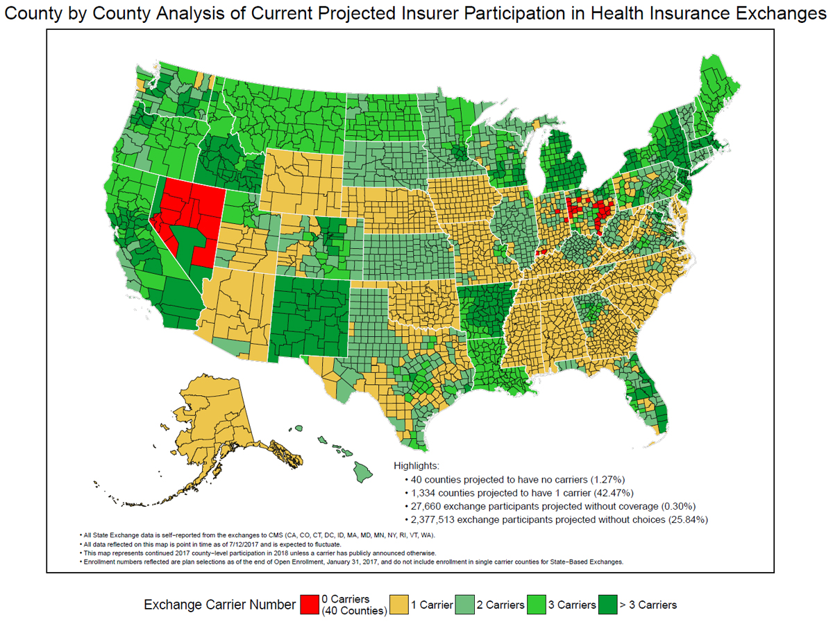
CMS also released an updated map this week depicting the number of health insurer carrier choices available in each county. The yellow portions in the map below represents the 1,334 counties in America—42.47 percent of all counties—in which people have only one carrier option, meaning they they have no choice.
For some counties, the problem goes well beyond being stuck with just one carrier. Some counties may have no carrier at all. Right now there are 40 counties in Nevada, Indiana, and Ohio (the red counties on the map) in which there is no carrier currently planning to offer coverage. Even if these states end up filling in these counties with coverage, the coverage will no doubt be second, third or fourth rate.
President Obama promised that Obamacare “means more choice, more competition, lower costs for millions of Americans.” But premiums doubled and, as the map below clearly shows, the elimination of choice is spreading across the country.
Republicans have their chance to begin fixing Obamacare. A new Senate version of repeal and replace came out yesterday that keeps hope alive for an agreement. But it’s time for Republicans to move beyond giving snippets of hope and delivering on their own promises to repeal and replace Obamacare.
(Click map to enlarge)