Income and wealth are not fixed ‘pies’
Between 1800 and 2016, the Gross Domestic Product (GDP) of the United States grew by 82,806% in real terms. This was a historically unprecedented explosion of income, wealth, and material well-being and its benefits have been experienced by all. Over the same period, the population of the US increased by 3,153%. Because the growth rate of the economy was so much greater than the growth rate of the population, GDP per capita increased by 2,449%.
As a result, not only are poor Americans today much better off than poor Americans of years gone by, but the average American is better off than even the richest American of their great grandparent’s era. Simply put, over the long run, a growing economy has made us all better off.
So, you have to be wary when someone tells you that you can only get better off by grabbing some of someone else’s piece of a fixed ‘pie’ of wealth. It just isn’t true. As the economist Milton Friedman put it, “Most economic fallacies derive from the tendency to assume that there is a fixed pie, that one party can gain only at the expense of another.”
If it was true that their was a fixed ‘pie’ of wealth or of income and that we could only get better off by taking some of someone else’s slice, you would expect to see the incomes of the poorest highest in states where the incomes of the rich are lowest. In other words, as the income of the rich rises, the incomes of the poor should fall.
But that is not what we see. In fact, we see the exact opposite. As Figure 1 shows, there is a strong link between the incomes of the very rich (the 95th percentile) and the incomes of the less well off (the 20th percentile). Where the very rich have higher incomes so do the less well off. In states like Maryland and New Jersey, where the rich have some of the highest household incomes in America, the poor also fare well compared to other states (ranking 2nd and 6th among for 20th percentile incomes). The people in the 20th percentile haven’t been made better off by taking slices of ‘the rich’s’ pie, there is a just a bigger pie.
Figure 1: Incomes of top earning households and the lowest earning households
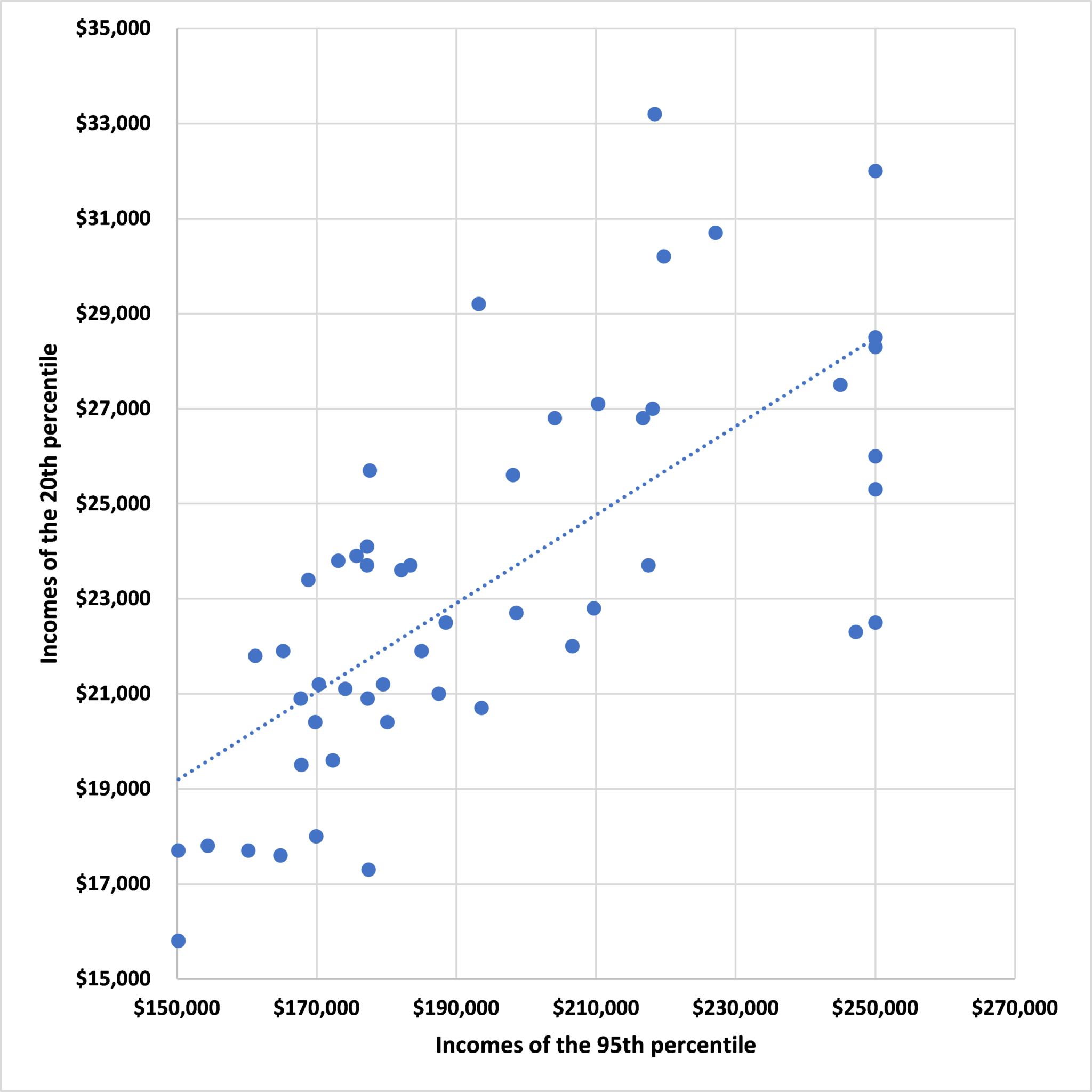
Source: Statistical Atlas
John Phelan is an economist at the Center of the American Experiment.